Objects
The available objects that can populate the panel are:
- LED
- Buttons
- Switches
- Texts
- Messages
- Pictures
- Analog Indicators
- Sliders
- Plots
- Edit
- Desktop
- Panel Commands
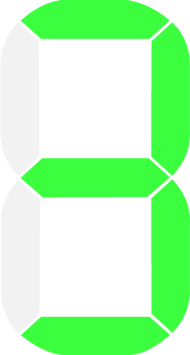
LED
LEDS
1. Object definition
Two different kinds of LEDs can be inserted into the panel:
- Predefined LEDs are indicators with fixed, already defined, graphics (the designer can choose among available types).
- Customized LEDs are indicators that allow the designer to choose the images which should appear for each state of the indicator (the images must be selected among those available, see image gallery). Moreover, it is possible to have up to 10 states.
Predefined LEDs
A predefined LED can be added to the panel using the following syntax:
| L |
ID | type | [stylers] | [events] | : status : [text] ; |
The fields between brackets [ ] are optional
The following table describes in details the meaning of each field
| Field | Lengh | Description | Values |
|---|---|---|---|
| L | 1 char | Fixed char that starts the LED definition | L |
| ID | 1 char | Unique ID to identify the led on the Panel. This field can be a decimal digit or an upper-case character. The maximum number of LEDs that can be created on the panel is 20 | (0,9)-(A,J) |
| type | variable | One or more upper-case characters that identify the type of LED to be created (such as graphics, color, border…) |
see LED types below |
| [stylers] | variable | One or more stylers that define the graphical appearance of the LED (such as, size, position, opacity, border, background, …). Some stylers may not take effect on the LED. | see stylers |
| [events] | variable | One or more event specifiers | see events |
| status | 1 char | Define the initial state of the LED (on/off). The LEDs with “type” = {R,G,B,Y} have only 2 states (0,1), while other LED types may have up to 10 different states. | (0,1) or (0,9) |
| [text] | variable | The text that will appear next to the LED (right side). To insert different texts, please use the Text object. | All characters except semi-colon (;) |
| EXAMPLE n1 |
|
|---|---|
|
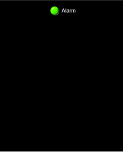
Target:
Panel with a green LED. State on; text “Alarm”; default styles; Message: L1G:1:Alarm; |
 |
| EXAMPLE n1 | |
|---|---|
|
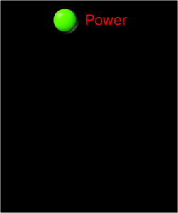
Target:
Panel with a green LED. Message: L1G*20#F00:1:Power; |
 |
Customized LEDs
The fields between brackets [ ] are optional
The following table describes in details the meaning of each field
| L | ID | type |
[stylers] | [events] | : status : image_0 , image_1 , …. , image_N; |
Where the fields above has the same meaning described for predefined LEDs, with the exception that:
- Field type = ‘M’ (multi-image)
- The number N of states are equal to the number of images you specify on the fields “image_xx” (max 10) .
Examples
LED having 4 states (for each state the image n. 1.101, 1.102, 1.103 1.104 respectively): L1M:0:1.101,1.102,1.103,1.104;
2. LED Usage
The following explanation is valid for all LED types.
Change the LED status (Controller –> WiFi Module –> Panel screen)
The microcontroller can changes the status of a LED on the panel by sending a simple message to the WiFi module.
The message format is:
| # |
L | ID | status |
Examples. Switch on the LED with ID=1: #L11 – Switch off the LED with ID=1: #L10
Note: Some types of LEDs could have more than two states.
Events (Panel screen –> WiFi Module –> Controller)
Read the events section to learn how to enable and manage the events for this object.
3. LED types
The following list reports the predefined LEDs. For Customised LEDs please refer to the list of global images, available in the Image section.
| Type |
Status |
|
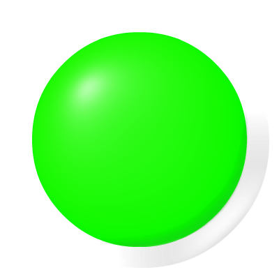
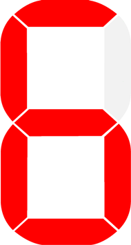
| 0R |  |
 |
| 0 | 1 | |
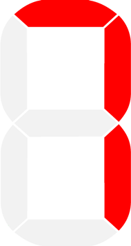
| Type |
Status | |
| 1R |  |
 |
| 0 | 1 | |
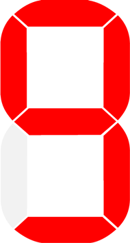
| Type |
Status | |
| 2R |  |
 |
| 0 | 1 | |
| Type |
Status | |
| 3R |  |
 |
| 0 | 1 | |
| Type |
Status | |
| 4R |  |
 |
| 0 | 1 | |
| Type |
Status |
|
| 0G | 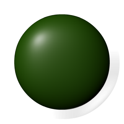 |
 |
| 0 | 1 | |
| Type |
Status | |
| 1G |  |
 |
| 0 | 1 | |
| Type |
Status | |
| 2G |  |
 |
| 0 | 1 | |
| Type |
Status | |
| 3G |  |
 |
| 0 | 1 | |
| Type |
Status | |
| 4G |  |
 |
| 0 | 1 | |
| Type |
Status |
|
| 0B |  |
 |
| 0 | 1 | |
| Type |
Status | |
| 1B |  |
 |
| 0 | 1 | |
| Type |
Status | |
| 2B |  |
 |
| 0 | 1 | |
| Type |
Status | |
| 3B |  |
 |
| 0 | 1 | |
| Type |
Status | |
| 4B | |
|
| 0 | 1 | |
| Type |
Status |
|
| 0Y |  |
 |
| 0 | 1 | |
| Type |
Status | |
| 1Y |  |
 |
| 0 | 1 | |
| Type |
Status | |
| 2Y |  |
 |
| 0 | 1 | |
| Type |
Status | |
| 3Y |  |
 |
| 0 | 1 | |
| Type |
Status | |
| 4Y |  |
 |
| 0 | 1 | |
| ype |
Status |
|
| 0P |  |
 |
| 0 | 1 | |
| Type |
Status | |
| 1P |  |
 |
| 0 | 1 | |
| Type |
Status | |
| 2P |  |
 |
| 0 | 1 | |
| Type |
Status | |
| 3P |  |
 |
| 0 | 1 | |
| Type |
Status | |
| 4P |  |
 |
| 0 | 1 | |
| Type |
Status | |||||
| 1N |  |
 |
 |
 |
 |
 |
| 0 | 1 | 2 | 3 | 4 | 5 | |
| Type |
Status | |||||
| 2N |  |
 |
 |
 |
 |
 |
| 0 | 1 | 2 | 3 | 4 | 5 | |
| Type |
Status | |||||||||
| 5 |  |
 |
 |
 |
 |
 |
 |
 |
 |
 |
| 0 | 1 | 2 | 3 | 4 | 5 | 6 | 7 | 8 | 9 | |
| Type |
Status | |||||||||
| 5R |  |
 |
 |
 |
 |
 |
 |
 |
 |
 |
| 0 | 1 | 2 | 3 | 4 | 5 | 6 | 7 | 8 | 9 | |
Buttons
Buttons
1. Object definition
The fields between brackets [ ] are optional.
The following table describes in details the meaning of each field.
Syntax
Buttons on the panel are defined using the following syntax:
| B |
ID | [type] | [stylers] | [events] | : [text] ; |
| Field | Lenght | Description | Values |
|---|---|---|---|
| B | 1 char | Char that define the object button | B |
| ID | variable | Unique ID to identify the button on the Panel. This field can be a decimal digit or an upper-case character. | (0,9)-(A,Z) |
| [type] | – | Actually not used | – |
| [stylers] | One or more stylers that define the graphical appearance of the button (such as, size, position, opacity, border, background, …). Some stylers may not take effect because meaningless for this object. |
see stylers | |
| [events] | One or more event specifiers | see events | |
| [text] | The text that will appear on the button. | All characters except semi-colon “;” |
| Analog BAR: example n. 2 | ||||
|---|---|---|---|---|
| Target: | Syntax: | Message: | 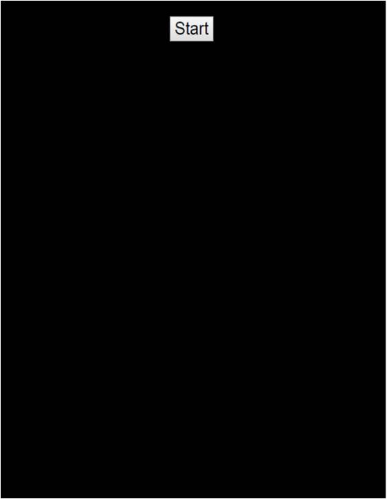 |
|
| Create a panel with a basic button with text “Start”. | object: ID: type: stylers: text: |
B 1 – – Strart |
B1:Start; | |
| Analog BAR: example n. 2 | ||||
|---|---|---|---|---|
| Target: | Syntax: | Message: | 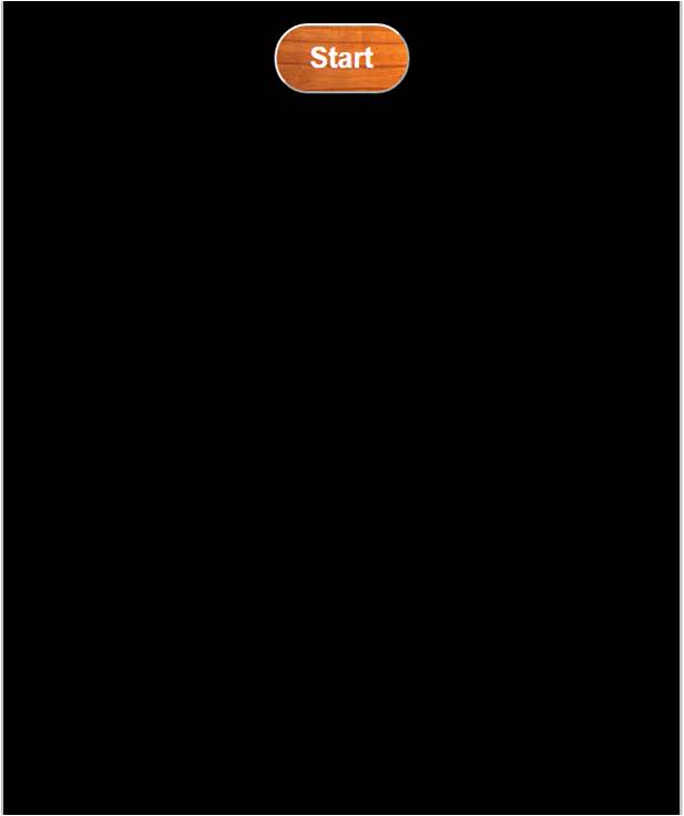 |
|
| Create a panel with a button with text “Start”. Dimensions: 20×10; rounded border (radius 30); image n. 1 as background; white bold text. |
object: B ID:1 type: – stylers: text: |
B 1 – %20,10r30g1 #FFFfb Start |
B1%20,10r30g1#FFFfb: Start; |
|
2. Object usage
When the user pushes a button on the Panel, a message is sent to the WiFi Module and, therefore, to the Controller.
Button pressed (Panel —> WiFi Module —> Controller)
The sent message has the following syntax:
Syntax:
| # |
B | ID | P |
Where the fixed character ‘P’ is sent for any button.
Example:
- Notification of button (having ID=1) pressed on panel: #B1P
Events (Panel —> WiFi Module —> Controller)
Read the events section to learn how to enable and manage the events for this object.
Switches
Switches
A switch is an object that has two (or more) stable states. Each time the user presses the switch on the panel, its status changes accordingly, and a corresponding message is sent to the Controller in order to notify the change.
It is also possible to trigger a switch status change from the Controller, by sending to Panel App a specific message through the WiFi module.
1. Object definition
To define a switch on the panel, two different syntaxes can be used, depending on the type of switch chosen:
- the first syntax permits to define a switch with a fixed, already defined, graphic (chosen among those available, at end of this page).
- the second syntax has been developed to permit to choose the image which should appear for each state of the switch (the images must be selected among those available, see the image gallery). Moreover, it is possible to have more than two states (up to 10 states).
Syntax n. 1
To define a switch on the panel, the syntax is:
| W | ID | [type] | [stylers] | [events] | : status ; |
The fields between brackets [ ] are optional. The following table describes in details the meaning of each field.
| Field | Lenght | Description | Value |
|---|---|---|---|
| W | 1 char | Field that defines the object switch | W |
| ID | 1 char | Unique ID to identify each switch on the panel. This field can be a decimal digit or an upper-case character. The max number of switches that can be created on the panel is 20. |
(0,9)-(A,J) |
| [type] | variable | One or more upper-case characters that identify the graphical look of the switch. See the collection at the bottom of this page. | see below |
| [stylers] | variable | One or more stylers that define the graphical appearance of the switch (such as, size, position, opacity, border, background, …). Some stylers may not take effect because meaningless for this object. | see stylers |
| [events] | variable | One or more event specifiers | see events |
| status | 1 char | Define the initial state of the switch (on/off). Some switch types could have up to 10 states |
(0,1) or (0,9) |
| Example n.1 | |
|---|---|
|
Target:
Panel with a switch type n.0; initial status: OFF Syntax: WA0:0; |
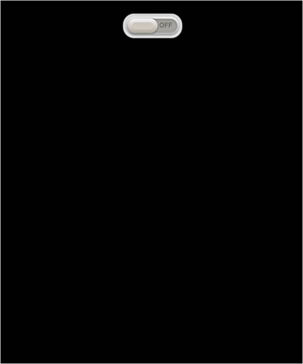 |
Syntax n. 2
To define a switch that permits to specify the images to be used for each switch state, the syntax is:
| W | ID | type | [stylers] | [events] | : status : image_0 , image_1 , …. , image_N; |
Where the fields above have the same meaning described for syntax n.1, with exception that:
- Field type = M (multi-image)
- The number N of states are equal to the number of images specified on the fields “image_xx” .
Example
Switch having 4 states (with images n. 1.1, 1.2, 1.3 1.4 respectively): W1M:0:1.1,1.2,1.3,1.4;
2. Object usage
The follow explanation is valid for all switch types (defined using either syntax n.1 or syntax n.2).
Change the status of the SWITCH (Panel <—> WiFi Module <–> Controller)
Usually the status of a switch is changed from the µPanel APP, when the user click on it; in this case the APP will send the notification to WiFi module, but is also possible for the Controller to change the status of the switch on the panel, by sending to the APP a message with the same following syntax:
| # |
W | ID | status |
Examples
Turn-ON the switch with ID=1: #W11
Turn-OFF the switch with ID=1: #W10
Note:
Some switch types could have more than two states.
Events (Panel —> WiFi Module —> Controller)
Read events section to learn how to enable and manage the events for this object.
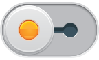
3. Switch types
| Type |
Status | |
| 0 |  |
 |
| 0 | 1 | |
| Type |
Status | |
| 1 |  |
 |
| 0 | 1 | |
| Type |
Status | |
| 2 |  |
 |
| 0 | 1 | |
| Type |
Status | |
| 3 |  |
 |
| 0 | 1 | |
| Type |
Status | |
| 4 | 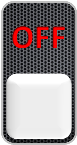 |
 |
| 0 | 1 | |
| Type |
Status | |
| 5 |  |
 |
| 0 | 1 | |
| Type |
Status | |
| 6 |  |
 |
| 0 | 1 | |
| Type |
Status | |
| 7 |  |
 |
| 0 | 1 | |
| Type |
Status | |
| 8 |  |
 |
| 0 | 1 | |
| Type |
Status | |
| 9 |  |
 |
| 0 | 1 | |
| Type |
Status | |
| A |  |
 |
| 0 | 1 | |
| Type |
Status | |
| B |  |
 |
| 0 | 1 | |
| Type |
Status | |
| C | 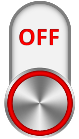 |
 |
| 0 | 1 | |
| Type |
Status | |
| D |  |
 |
| 0 | 1 | |
| Type |
Status | |
| E |  |
 |
| 0 | 1 | |
| Type |
Status | |
| F |  |
 |
| 0 | 1 | |
| Type |
Status | |
| G |  |
 |
| 0 | 1 | |
| Type |
Status | |
| H |  |
 |
| 0 | 1 | |
| Type |
Status | |
| I |  |
 |
| 0 | 1 | |
| Type |
Status | |
| L |  |
 |
| 0 | 1 | |
| Type |
Status | |
| N | 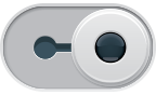 |
 |
| 0 | 1 | |
| Type |
Status | |
| O |  |
 |
| 0 | 1 | |
Texts
Texts
Text objects are used to include static messages on the Panel, such as LEDs names or other labels.
The text is static, thus it can not be changed after the panel layout has been sent to APP, unless a new panel layout is sent.
To include dynamic messages on the Panel, which can be changed by remote system during the run-time, the message object should be used instead.
1. Object definition
Syntax
A static text can be included on the Panel using the following syntax:
| T | [ID] | [type] | [stylers] | [events] | : text; |
Field between [ ] are optional.
The following table describes in detail the meaning of each filed:
| Field | Length | Description | Value |
|---|---|---|---|
| T | 1 char | Fixed char that identifies the text object | T |
| [ID] | – | not used | – |
| [type] | – | not used | – |
| [stylers] | variable | One or more stylers that define the graphical appearance of the text (such as, size, position, opacity, border, background, …). Some stylers may not take effect because meaningless for this object. |
see stylers |
| [events] | One or more event specifiers | see events | |
| text | variable | The text string to display | All chars except ‘;’ |
| Analog BAR: example n. 2 | ||||
|---|---|---|---|---|
| Target: | Syntax: | Message: | 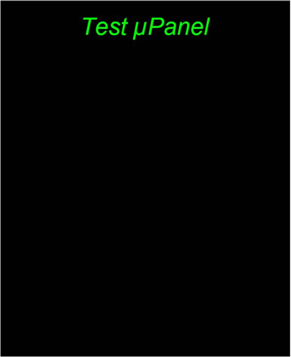 |
|
| Green text “Test μPanel“. Defined size, italic font. | object: T ID: – type: – [stylers]: text: |
T – – #0F0*20fi Test µPanel |
T#0F0*20fi:Test µPanel; | |
2. Object usage
Events (APP —> WiFi Module)
Read the events section to learn how to enable and manage the events.
Messages
Messages
The Message object is used to display on the panel a string of characters that can be updated by the controller subsequently to panel definition, during the run-time.
If you want to write static texts (such as the name of a LED on the panel) use the object text instead.
If you want to send a string of characters from the panel to the remote system, use the object edit.
1. Object definition
Syntax
A message can be defined on the Panel using the following syntax:
| M | ID | [type] | [stylers] | [events] | : text ; |
Field between [ ] are optional.
The following table describes in details the meaning of each filed:
| Field | Lenght | Description | Value |
|---|---|---|---|
| M | 1 char | Field that defines the object message | M |
| ID | 1 char | Unique ID to identify each message on the panel. This field can be a decimal digit or an upper-case character. The max number of messages that can be created on the panel is 16. |
(0,9)- (A-F) |
| [type] | – | not used | – |
| [stylers] | variable | One or more stylers that define the graphical appearance of the message (such as, size, position, opacity, border, background, …). Some stylers may not take effect because meaningless for this object. | see stylers |
| [events] | One or more event specifiers | see events | |
| text | variabile | Initial string of characters to display (can be modified dynamically). The max message length is 63 chars). | All ASCII chars except ‘;’ |
| Example n.1 | ||||
|---|---|---|---|---|
| Target: | Syntax: | Message: | ||
| Message with a defined font color and dimension. | object: ID: type: [stylers]: |
M 1 – #F00*10 Alarm at 9:00 AM >> Cancel this message? |
M1#F00*10:Alarm at 9:00 AM >> Cancel this message?; | 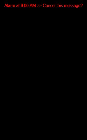 |
2. Object usage
Update the text of the message (Panel <– Wi-Fi Module <– Controller)
To overwrite the old text with by the new one, use the following syntax:
| # |
M | ID | text |
Examples
Write the message “New text” using the message objetc with ID=1 : #M1New text
Note: To interact with the object in the panel, the message object has to be previously created during the panel definition step. Remeber to finish every command with ‘\n’ string terminator character.
Events
Read the events section to learn how to enable and manage the events for this object.
Pictures
Pictures
The Picture object can by used to add an image on the panel, selected from those provided with the APP (see the image gallery).
It is possible to set size, position and other stylers of the image on the panel.
If you want to use an image as a background, also evaluate the use of the object desktop.
If you need to dynamically change a picture on panel during runtime (imagine a weather icons), you can use the object LED (customized LEDs version).
1. Object definition
Syntax
The syntax used to add an image to the panel is the following:
| I | ID | type | [stylers] | [events] |
The fields between brackets [ ] are optional
The following table describes in details the meaning of each field
| Field | Lengh | Desciption |
|---|---|---|
| I |
1 char | Field that defines the object picture |
| ID | – | not used |
| Type | variabile | Identifies the image from those available |
| [stylers] | variabile | One or more stylers that define the graphical appearance of the image (such as, size, position, opacity, border, background, …). Some stylers may not take effect because meaningless for this object. |
| [events] | One or more event specifiers |
| Example n.1 | ||||
|---|---|---|---|---|
| Target: | Syntax: | Message: |  |
|
| Create a panel loading the image n. 7.13 having a size of 80% (with respect the horizontal dimension of the display). Default position. | object: ID: type: [stylers]: |
I – 7.13 %80 |
I7.13%80; | |
2. Object usage
Pictures are static objects: this means that once defined on panel screen, you can not modify it.
But the interaction with an image on the panel, is possible through the events.
Events (Panel —> WiFi Module —> Controller)
Read events section to learn how to enable and manage the events.
Analog Indicators
Analog Indicators
An indicator is a panel object that allows you to represent a numerical value, which usually varies between a minimum and a maximum.
There are two types of indicators: the “analog bars“ and the “analog gauges“.
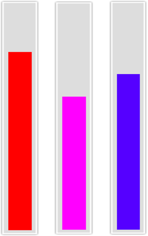

The two types of indicators have different syntax for their definition and usage, so each type will be described below separately.
1. Object Definition
Syntax of the ANALOG BAR
An analog bar can be added to the panel using the following syntax:
| A | ID | [type] | [stylers] | [events] | : min : level: max : [internal_style]; |
Field between [ ] are optional.
The following table describes in detail the meaning of each field:
| Field | Lenght | Description | Values |
|---|---|---|---|
| A | 1 char | Char used to identify the object indicator. | A |
| ID | 1 char | Unique ID to identify each indicator on the panel. This field can be a decimal digit. You can define up to 10 indicators (bars + gauges) on each panel screen. |
(0,9) |
| [type] | 1 char | Leave this field empty or specify type=”B” for the type analog bar. | B |
| [stylers] | variable | One or more stylers that define the graphical appearance of this object (such as, size, position, opacity, border, background, …). The style “f” permits to display the numerical value of the level on the bar. Can be specified in succession more styles. Some stylers may not take effect because meaningless for this object. |
see stylers |
| [events] | One or more event specifiers | see events | |
| min | variable | Minimum value (empty level). | ]-∞,max[ |
| level | variable | Initial depicted level; in the range [min,max]. Can be a decimal number (es: 12.3456) | [min,max] |
| max | variable | Maximum value (full scale value) | ]min, +∞[ |
| [internal_style] | variable | Internal style of the ‘filled’ portion of the bar. More stylers can be specified. |
| Analog BAR: example n.1 | ||||
|---|---|---|---|---|
| Target: | Syntax: | Message: | 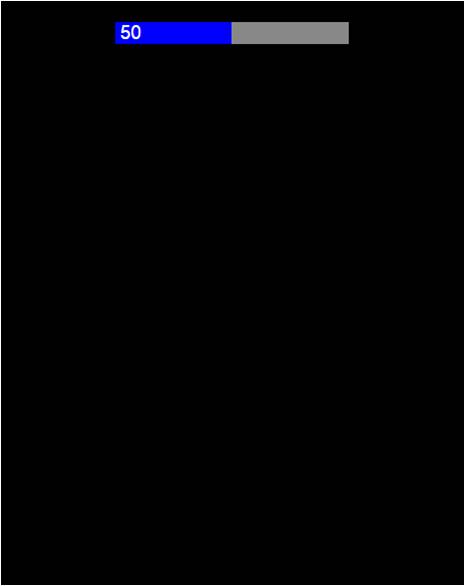 |
|
| Panel with an analog bar. Range of (0,100) and bar level of 50. Level value depicted. |
object: ID: type: [stylers]: min: level: max: [internal_style]: |
A 1 – !888 o 50 100 – |
A1f!888:0:50:100; | |
| Analog BAR: example n. 2 | ||||
|---|---|---|---|---|
| Target: | Syntax: | Message: | 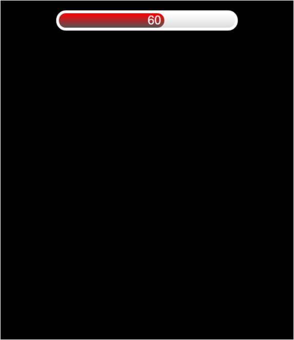 |
|
| Panel with an analog bar. Rounded border with thickness 10, default color.Text aligned to the right. Range (0,100) and initial bar level set to 60. Background color: white with a gray nuance. Inner bar color: red with a gray nuance. | object: ID: type: [stylers]: min: level: max: [internal_style]: |
A 1 – -10r30!FFF,DDD> o 60 100 !F00,555 |
A1-10r30!FFF,DDD>:0:60:100:!F00,555; | |
| Analog BAR: example n. 2 | ||||
|---|---|---|---|---|
| Target: | Syntax: | Message: | 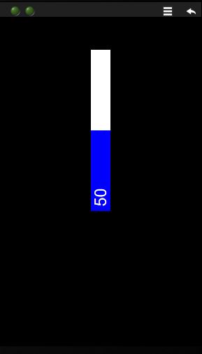 |
|
| Panel with an vertical analog bar (bar rotated by -90 degrees). To do this, can be place a analog bar inside a container (i.e a table) and rotate the container of -90 degree using the style ‘a’. The styler displacement ‘d’ is used to relocate the slider in panel. | Tag container: [styler cont.] object: ID: [type]: [stylers]: min: level: max: [internal_style] Tag container: |
{ a-90 d0,50 A 1 B %80 *20 !FFF 0 50 100 !00F } |
{a-90d0,50A1B%80*20!FFF:0:50:100:!00F;} | |
Syntax of the ANALOG GAUGE
An analog gauge can be added to the panel using the following syntax:
| A | ID | type |
[style] |
[event] |
: image_back : image_index : index_angle : [index_style] : [offset] : [k] ; |
Field between [ ] are optional.
The following table describes in detail the meaning of each field:
| Field | Lenght | Description | Values |
|---|---|---|---|
| A | 1 char | Char used to identify the object analog bar. | A |
| ID | 1 char | Unique ID to identify each indicator on the panel. This field can be a decimal digit. You can define up to 10 indicators (bars + gauges) on each panel screen. |
(0,9) |
| type | 1 char | Use Type = ‘G’ to specify the analog gauge. | G |
| [stylers] | variable | One or more stylers that define the graphical appearance of this object (such as, size, position, opacity, border, background, …). Can be specified in succession more styles. Some stylers may not take effect because meaningless for this object. |
see stylers |
| [events] | One or more event specifiers | see events | |
| image_back | variable | Number of the image used as background (es. the dial image ‘5.10’). | see image gallery |
| image_index | variable | Number of the image used as index for the gauge. This image can be rotated around its center. (es. the index image ‘5.11’) | see image gallery |
| index_angle | variable | Initial rotation of the image used as index. Can be a decimal number (es: 12.35 degree) | [0,360] |
| [index_style] | variable | Optional. One or more style for the index image. | see stylers |
| [offset] | variable | Usign an “offset” and the coefficient “k” is possible to align the rotation of the index image to the graduated gauge of a dial. The formula is:
index rotation = offset + K (index_angle) |
[0,360] |
| [K] | variable | any number |
| Analog GAUGE: example n.1 | ||||
|---|---|---|---|---|
| Target: | Syntax: | Message: | 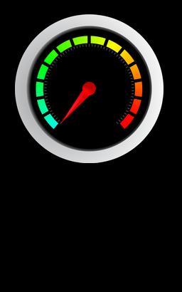 |
|
| Panel with an analog gauge composed from image n. 5.20 as background and the image 5.21 as dial. No initial ratation (0°). Default position and size. |
object: ID: type: image_back: 5.20 image_index: 5.21 index_angle: 0 |
A 0 G 5.20 5.21 0 |
A0G:5.20:5.21:0; | |
| Analog GAUGE: example n. 2 | ||||
|---|---|---|---|---|
| Target: | Syntax: | Message: | 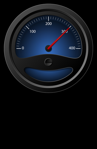 |
|
| Panel with an analog gauge composed from the image 5.22 as dial and 5.23 as index. Rotation of index adapted with the graduated gauge of the dial in order to have 1:1 correspondence (i.e. with an index_angle = 300 the index will align with the level of 300 of graduated gauge). |
object: ID: type: image_back: 5.20 image_index: 5.21 index_angle: index_style: offset: K: |
A 0 G 5.20 5.21 300 – 0 0.45 |
A0G:5.22:5.23:300::0:0.45; | |
2. Object usage
Update the analog bar level (Controller –> WiFi Module –> Panel screen)
Syntax
| # |
A | ID | : value |
Examples
Update the analog bar having ID=1 with a level value of ’55’: #A1:55
Rotare the index of the analog gauge having ID=1 with a value of ’55’: #A1:55
Note:
The level should be inside the range [min,max] that you have decided for the analog bar during the panel definition.
To interact with the object in the panel, the object has to be previously created during the panel definition step.
Events (Panel screen –> WiFi Module –> controller)
Read the events section to learn how to enable and manage the events.
Sliders
Sliders
The Slider object can be used to add to the Panel a sliding cursor that can be moved by the user, either horizontally or vertically. The sliding cursor allows the user to make adjustments to a value throughout a predefined range.
1. Object Definition
Syntax
To define a slider on the panel, the syntax is:
| R | ID | [type] | [stylers] | [events] | : min : max : step : [value] : [notify] ; |
The fields between brackets [ ] are optional
The following table describes in detail the meaning of each field
| Field | Lengh | Description | Value |
|---|---|---|---|
| R | 1 char | Fixed char that identifies the object slider | R |
| ID | 1 char | Char which identifies the slider univocally on the Panel. This field can be a decimal digit. The maximum number of sliders that can be created on the panel is 10. |
(0,9) |
| [type] | not used | ||
| [stylers] | variable | One or more stylers that define the graphical appearance of the slider (such as, size, position, opacity, border, background, …). The style “v” (which works with sliders only) permit to define a slider in vertical position. |
see stylers |
| [events] | One or more event specifiers | see events |
|
| min | variable | Min value of the sliding range | ]-∞,∞[ |
| max | variable | Max value of the sliding range | ]-∞,∞[ |
| step | variable | Amplitude of the minimum cursor movement (resolution) | ]0,max] |
| [value] | variable | Initial cursor position. If omitted, value = min. | [min, max] |
| [notify] | variable | Interval in milliseconds between the sending of two notifications to the microcontroller during sliding. Minimum 50 ms. If notify = ‘0’, the notification is sent only upon the slider release. If not specified, the default value is 500 ms. |
| Example n.1 | ||||
|---|---|---|---|---|
| Target: | Syntax: | Message: | 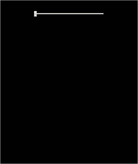 |
|
| Panel with an horizontal slider. Width 60% (with respect the horizontal display dimension). Sliding range (0,100) with step of 1 unit. Selected value of 0. Notify interval of 100 ms. |
object: ID: type: [stylers]: min: max: step: value: [notify]: |
R 1 – %60 o 100 1 0 100 |
R1%60:0:100:
1:0:100; |
|
2. Object usage
Set a new value (Panel <—> WiFi Module <—> Controller)
You can change the value of the slider from the µPanel APP just moving its cursor: the APP will send the notification to WiFi module at regular intervals during the sliding (the notification interval is set when you define the slider on the panel) or at the release of the cursor.
The serial message that the controller will receive has the following syntax:
Syntax
| # |
R | ID | : value |
Example (Panel —> WiFi Module —> Controller)
Notification that the cursor with ID=1 is still held and currently moved on the value ’54’ : #r1:54
Notification that the cursor with ID=1 has been moved and released on the value ’55’: #R1:55
Note that the value of a slider already defined on the panel, could be changed by the remote system using the same syntax.
Example (Panel <— WiFi Module <— Controller)
The controller place the cursor of slider with ID=1 to the value ’54’ : #R1:54
Events (Panel —> WiFi Module –> Controller)
Read the events section to learn how to enable and manage the events.
Plots
Plots
The plot object permits to display on the panel a figure that graphically shows the trend of a variable. This object automatically collects values of X and Y and add the corresponding points to the Plot. This object can automatically select the best scale to show the figure, or automatically generate the X values in case the sequence of x values is incremental by 1. If required, the user can manually specify both the ranges for the scales and the number of grid divisions.
1. Object Definition
Syntax
A plot can be added to the panel using the following syntax:
| G | ID | [type] | stylers | [events] | : [xmin,xmax,ymin,ymax,xdiv,ydiv] : title : label_x : label_y : track_col : title_col : axes_col : grid_col : back_col ; |
The fields between brackets [ ] are optional.
The following table describes in detail the meaning of each field.
| Field | Lenght | Description | Values |
|---|---|---|---|
| G | 1 char | the char that defines the plot object | G |
| ID | 1 char | unique ID to identify the plot on the panel. This field can be only 0 | 0 |
| [type] | 1 char | This field is optional and can be:
“A” : the x values are automatically generated. Only y values required. |
– |
| stylers | variabile | The styler “%” (dimension) is mandatory for the plot.
The optional styler “*” (size) is helpfull to adjust the dimiension of text labels. You can add more styler that define the graphical appearance of the Plot (such as size, position, opacity, border, background…) Some stylers may not take effect because meaningless for this object. |
see stylers |
| [events] | One or more event specifiers | see events |
|
| xmin to ydiv | variable | These are optional parameters that define the axis limits and the number of divisions of the grid. Each parameter is separated by a comma (,). Parameters can be left empty.
xmin defines the x-axis minimum value If axis limits are not specified or omitted, the plot will use the autoscale function. |
|
| title | variabile | Title text | ASCII characters except “:” and “;” |
| label_x | variabile | x-axis text | |
| label_y | variabile | y-axis text | |
| track_col | 3 chars | Color of the curve. (12-bit RGB hexadecimal format, i.e red=F00). |
3 chars HEX |
| title_col | 3 chars | Color of the title | 3 chars HEX |
| axes_col | 3 chars | Color of the axes | 3 chars HEX |
| grid_col | 3 chars | Color of the grid | 3 chars HEX |
| back_col | 3 chars | Color of the background | 3 chars HEX |
| Example n.1 | ||||
|---|---|---|---|---|
| Target: | Syntax: | Message: | 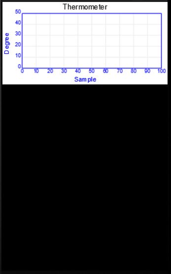 |
|
| Panel with a external dimension of 100×50 (with respect the horizontal dimension of the display) and a specified proportion between text and plot. Different colors for data line, title, axes, grid and background. |
object: ID: [type]: stylers: title: label_x: label_y: track_col: title_col: axex_col: grid_col: back_col: |
G 0 – %100,50*15 Thermometer Sample Degree F00 000 00F EEE FFF |
G0%100,50*15:0,100,0,50,10,5: Thermometer:Sample:Degree: F00:000:00F:EEE:FFF; |
|
2. Object usage
You can insert new points to your plot, add points to those already present or clear the plot.
The syntax to do these things, depends from the “type” of plot you have defined.
1. Plot defined without any “type” specification
Clear the plot & insert new points (Controller –> WiFi Module –> Panel screen)
Syntax
| #G0C |
: x1, y1, x2, y2, x3, y3, …. ; |
The character “C” in the mnemonic code, specifies the “clear” operation before to plot the new point (x,y).
Example:
Clear the plot and print the new points (4,5), (6,8), (9,15): #G0C:4,5,6,8,9,15;
Add points to plot (Controller –> WiFi Module –> Panel screen)
Syntax
| #G0P |
: x1, y1, x2, y2, x3, y3, …. ; |
The character “P” in the mnemonic code, specifies the “plot” operation without clear the plot.
Example:
Add to plot the points (4,5), (6,8), (9,15): #G0P:4,5,6,8,9,15;
2. Plot defined as type = “A”
Clear the plot & insert new points (Controller –> WiFi Module –> Panel screen)
Syntax
| #G0C |
: y1, y2, y3, …. ; |
The character “C” in the mnemonic code, specifies the “clear” operation before to plot the new point (x,y).
Example:
Clear the plot and print the new points having y1=3, y2=6, y3=4 and default increments for xi: #G0C:3,6,4;
Add points to plot (Controller –> WiFi Module –> Panel screen)
Syntax
| #G0P |
: y1, y2, y3, …. ; |
The character “P” in the mnemonic code, specifies the “plot” operation without clear the plot.
Example:
Add to plot the points having y1=3, y2=6, y3=4 and default increments for xi : #G0P:3,6,4;
Events (Panel —> WiFi Module —> Controller)
Read the events section to learn how to enable and manage the events for this object.
Edit
Edit
The Edit object defines a text box on the panel and allows the user to write in it a string of characters to be sent to the controller connected to the Wi–Fi module.
1. Object Definition
Syntax
An editable box can be added to your panel using the following syntax:
| E | ID | [type] | [stylers] | [events] | : [text]; |
The fields between brackets [ ] are optional.
The following table describes in details the meaning of each field.
| Field | Lenght | Description | Values |
|---|---|---|---|
| E | 1 char | Identifies the object type editable box. | E |
| ID | 1 char | Unique ID to identify each editable text box on the Panel. This field should be a decimal digit or an upper case char. The maximum number of editable text box that can be created on the panel is 20. |
(0,9)-(A,J) |
| [type] | – | not used | – |
| [stylers] | variable | One or more stylers that define the graphical appearance of editable text box (such as, size, position, opacity, border, background, …). Some stylers may not take effect because meaningless for this object. |
see stylers |
| [events] | One or more event specifiers | see events |
|
| [text] | variable | Default text to display. This text will be overwritten from the new one entered in the box by the user. It is possible insert a maximum of 64 characters. |
All chars except ‘;’ |
| Example n.1 | ||||
|---|---|---|---|---|
| Target: | Syntax: | Message: | 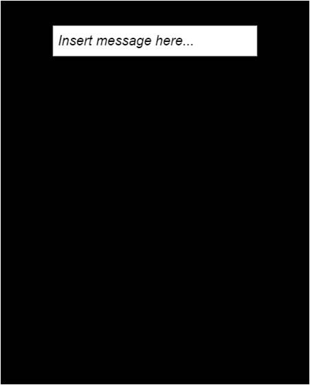 |
|
| Panel with an edit box with specific dimensions and default text “Insert message here…”. Font italic. | object: ID: type: [stylers]: [text]: |
E 1 – %60,8fi Insert message here … |
E1%60,8fi: Insert message here…; | |
2. Object usage
Send a string to your electronic system (Panel screen –> WiFi Module –> your controller)
From the panel screen, click on the text box and edit the message you want to send. As soon as you click on the enter key of your keyboard (or click outside the text box), the string will be sent.
The message received on the serial port by your controller has the following format:
| # | E | ID | : [text] |
Example
Notice of message “Clear Alarm” inserted and sent from text box having ID=1: #E1:Clear Alarm
Note:
The string inserted on the text box is sent only when the panel detects a change of the text, so if you try to send again the same string, the operation will fail.
Events (Panel screen –> WiFi Module –> your controller)
Read the events section to learn how enable and manage the events for this object.
Desktop
Desktop
The Desktop object allows you to graphically customise the background of the panel screen. It is particularly suitable to insert a texture (image repeated on the background) or a background color. If you want to insert an image on your panel, also evaluate the use of the object picture. You can search on the page image gallery for the complete collection of images.
1. Object Definition
Syntax
To specify the desktop look of your panel, just add a string with the folloowing syntax to your panel definition message:
| D | [ID] | [type] | stylers | [events] | ; |
Field between [ ] are optional.
The following table describes in details the meaning of each filed:
| Field | Lenght | Description | Values |
|---|---|---|---|
| D | – | Identifies the object desktop | D |
| [ID] | – | not used. | (0,9) |
| [type] | – | not used. | – |
| stylers | variable | Can define the color to use (using the style coded with “!”) or the texture image to use (using the style coded with “g”). Adding the style n it is possible to avoid repeating the picture in the desktop. |
|
| [events] | – | not used. | – |
| – | – | – | – |
| Example n.1 | ||||
|---|---|---|---|---|
| Target: | Syntax: | Message: | 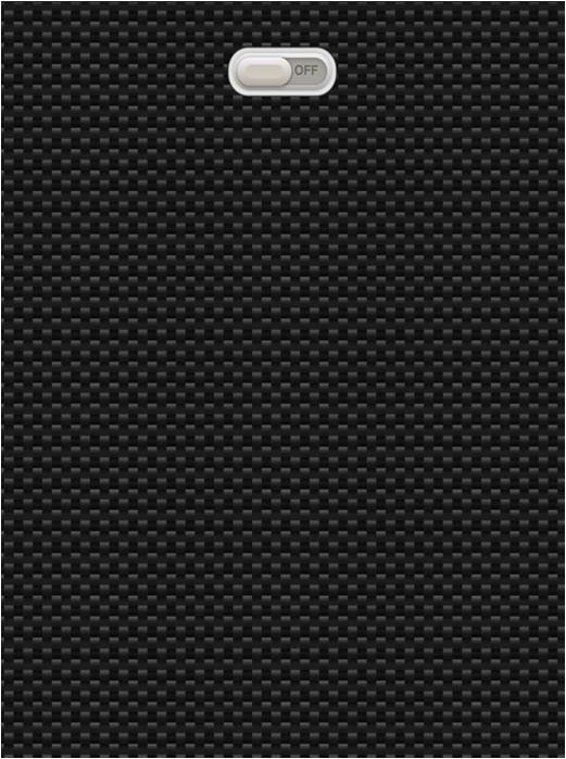 |
|
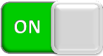
| Panel with the texture n. 21 (carbon fiber) which cover the desktop. A second object, a switch (type ‘0’) in off state is also inserted. |
object: ID: type: stylers: |
D – – g21 |
Dg21;WA0:0; | |
| Example n.2 | ||||
|---|---|---|---|---|
| Target: | Syntax: | Message: | 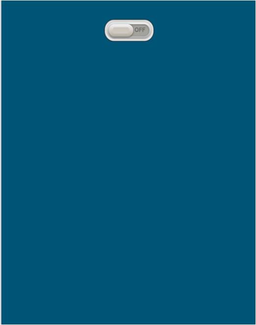 |
|
| Panel with a single color which covers the desktop. A second object, a switch (type ‘0’) in off state is also inserted. |
object: ID: type: stylers: |
D – – !057 |
D!057;WA0:0; | |
2. Object usage
This object does not allow any interaction.
Panel Commands
Panel Commands
Panel commands are actions the micro-controller can command to the APP and, thus, that will be executed on the user’s mobile device (in contrary of normal serial commands that are executed on the WiFi modules). Panel commands are conceived to request actions for changing some aspects of the graphical panel currently displayed on the screen (e.g. for dynamically changing the appearance of some objects or containers) but also for interacting with the internal resources of the mobile device and its operating system.
Panel commands are objects (virtual objects since they do not have a graphical appearance) so they follow the general syntax of common objects. In particular, they are sent and synchronised exactly as other normal objects (such as LEDs, Switches and so on). A total of 16 command slots exist (ID ranges from 0 to 9 and from A to F), each of them can contain a command string. When the micro-controller inserts a command string into a command slot, the µPanel system will send it to the APP as soon as possible. If the APP is not running the command is kept into its slot and delivered later (as soon as the mobile APP is on and connected). Exactly like other objects (e.g. LEDS), if the micro-controller inserts a new command string into an already filled command slot, the old command string is replaced by the new one. Therefore, the following 2 general rules apply:
- if the micro-controller changes the command string contained into a command slot before the old command is actually sent to the APP, the old command is lost and it will be never sent to the APP (this is exactly what happens for other objects: if you both turn on and off a LED when the APP is not connected, as soon as the APP connects only the last LED status (OFF) will be sent)
- the commands contained in all the command slots are received and executed by the APP each time the panel is received, unless a special option (SEQ) is set during the command string definition in order to tell the APP to execute each command only once.
Like other normal objects, panel commands can be set during the panel definition and can be changed later during the panel use. However, it is NOT mandatory to create a command slot during the panel definition to enable its subsequent use during run time (i.e. where # prefix is required, as explained below). Obviously, if a command slot is created and filled with a command string directly during the panel definition, the command is executed by the APP as soon as the panel is received and displayed.
An optional argument, called SEQ, permits to attach a SEQuential number to any issued commands. When the SEQ number is attached to a command, the APP will execute the command only once, even if it is received multiple times. In fact, the APP maintains in its memory its own SEQ counter and the received command will be executed only if its SEQ number is greater than those of all the previously received commands. The APP SEQ counter is cleared ONLY when a command with SEQ = 0 is sent. Please note that, the APP has only one global SEQ counter and it is therefore shared by all the command slots. Please note also that commands without SEQ argument or with SEQ = 0 are always executed.
When the command SEQ argument is specified, the micro-controller can request the APP to acknowledge the command execution simply by appending the upper case character A to the SEQ number. In this case, when the APP executes the command an acknowledge message is sent to the micro-controller, reporting the command slot ID and the SEQ number of the executed command.
1. Object definition (not mandatory)
Panel commands can be included in the panel definition using the following syntax:
| C | ID | [:SEQ[A]] | : command ;; |
Where the brackets [ ] denote optional fields. Please note the double semicolon at the end of the command definition. This is necessary since commands (or their parameters) could contain themselves a semicolon symbol.
The following table describes the meaning of each field.
| Field | Lenght | Description | Value |
|---|---|---|---|
| C | 1 char | Field that defines the virtual object panel command | C |
| ID | 1 char | Unique ID that identifies the command slot to be used. This field can be a decimal digit or an upper-case character in the range 0..9 or A..F. The max number of panel command slots available is 16. The maximum length of the command string (including the optional SEQ field) that can be inserted into command slots is of 60 characters, with the exception of the panel command slots with ID = {0,1,2} (on firmware 003 or later) that are bigger and that can contain up to 1000 characters. Please note that such bigger slots consume a system buffer of 1024 bytes, so if not necessary, it’s recommended using first ID in the range (3,9)-(A,F). Please refer to the Buffer section to find more information about the use of system buffers. |
(0,9)-(A,F) |
| SEQ | variable | It’s any decimal number representing an optional argument that can be used to attach a sequential number to the command. If this argument is specified, the APP will actually execute the issued command only if its SEQ number is bigger than those of all other previously issued commands. If SEQ is 0 (zero) the APP will clear its SEQ counter, re-enabling the execution of commands from SEQ = 0. Please note that the SEQ counter is a global value shared among all the command slots and that the SEQ counter is NOT cleared upon panel definition (the APP SEQ counter is cleared ONLY when a command with this field set to zero is sent) | decimal number |
| A | 1 char | Optional character that can be specified only when the SEQ field is specified as well. This character can be only the upper case character A. When specified, the APP will send a message to the micro-controller to acknowledge the command execution. E.g. when the command C3:5A:…. is issued, the following message will be sent to the micro-controller upon command execution: #C3:A5 where C3 represents the command slot with ID=3 and A5 represents the Acknowledge message of the command with SEQ=5 |
A |
| command | variable | Defines the specific command with its expected parameters. See below for the command list. The max command length is: 60 characters for panel command with ID in the range (3,9)-(A,F) and 1024 for panel command having ID in the range (0,2) and for firmware 003 or later. | ascii |
2. Object usage
Send a panel command (Panel <— WiFi Module <– Controller)
The syntax to use a command slot during the run time is :
Syntax
| # |
C | ID | [:SEQ[A]] |
: command |
where the meaning of each field is the same as described above in “Command definition”
Note:
As stated above, the panel commands follow the same panel synchronisation rules of other objects: if the user’s micro-controller sends a sequence of serial commands into the same command slot, when the APP is offline, only the last command will be sent to the APP when the connection is established. So, if the micro-controller defines a panel command with ID=0 and sequentially sends: #C0:command_1 and then #C0:command_2, when the APP will be restarted, the panel will execute the command_2 only.
3. LIST of existing Commands
Command ‘s’ (dynamically change stylers of objects and containers)
This command permits to change the stylers of objects and containers without sending a new panel. This command is useful to animate the panel during the run time, for instance for dynamically changing position, size, colours of objects or container. To use this command a unique global ID must be assigned during the panel definition to the object/container to animate. Global ID can be assigned by means of the styler ~ (tilde, ascii code 126) . Please refer to this styler section for more details on this styler usage.
Please note that all styler changes applied to objects/containers are always performed with respect to their initial state specified in the panel definition (previously changes applied through previous commands do not affect the final appearance).
Command ‘s’ syntax
The field command of the panel command object in this case is:
| s | ~ | global_id | : new_stylers |
where:
- the lowercase character ‘s’ identifies this command
- the character ‘~‘ is the styler that is used to attach a global ID to the object/container to animate
- global_id is the decimal value that has been assigned to the object/container through the ~ styler during the panel definition. Please note that the global_id is not the object ID.
- new_stylers represents one or more stylers that will overwrite the stylers defined for that object/constructor during the panel definition. Please note that only the specified stylers will be changed and that all the other stylers will remain unchanged with respect to their values specified in the panel definition. If the new_stylers field is empty, the object/container will return to its initial appearance specified in the panel definition.
Example 1.
Panel definition:
Define a panel with a container (having global_id = 1 with following styles: background = white, dimension= 50×50, and styler “align content at center”) and a object led inside (having object ID = 1 and status off).{~1!FFF%50,50^L1G:0;}
Object usage:
Using the panel command (slot 3), change the style “background color” (to color red) and the dimensions (to 20×20), add the style “border”, of the container with global id = 1, leaving the other styles as specified in the panel definition:#C3:s~1:!F00-%20,20
Note: the command can be specified directly into the panel definition as follow:
{~1!FFF%50,50^L1G:0;}C3:s~1:!F00-%20,20;;
Example 2.
Panel definition:
Define a panel with a message (having object ID = 0, global ID = 12, style color of the text = white, style size = 20, message “Alarm OFF”) and a button (having object ID = 1, and text = “set alarm”):M0~12#FFF*20:Alarm OFF;/10B1:set alarm;
Object usage:
Using the panel command (slot 3), change the style color of the text ‘#’ (to red) and size ‘*’ of the object with global ID 12:#C3:s~12:#005*30
Example 3.
Panel definition:
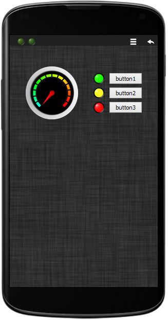
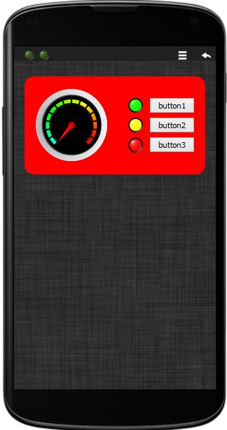
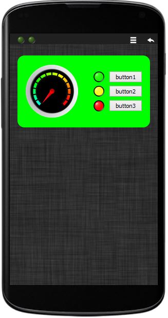
Define a panel with: object DESKTOP with a background image and a container (with global ID = 1) in which is placed an ANALOG INDICATOR object, three BUTTON objects and 3 LED objects.Object usage:
Dynamically change at each second the background color of the container (red, green, blue, transparent)
 |
 |
 |
|
 |
|
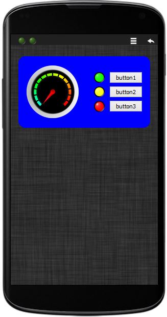 |
| Panel layout | dynamic changes | dynamic changes | dynamic changes |
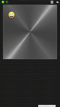
Example 4 – Animation: Bouncing Ball
Panel definition:
Define a panel with: object DESKTOP with the background image n. 21 and a container (with a background image n. 2) in which is placed a PICTURE object (smile emoticon n. 7.55) having the global ID = 1.Object usage:
Dynamically change the absolute position of the object PICTURE (by changing the style ‘@’)Video of the Animation: